
Interior Design Color Palette
The Ultimate Guide to Choosing Colors With Confidence
Color is one of the most powerful tools in interior design. It shapes how a space feels, how large it appears, and how people experience it emotionally. Yet choosing the right interior design color palette often feels intimidating. Many homeowners default to white walls or safe neutrals simply because they are afraid of making the wrong choice.
The truth is that color itself is rarely the problem. What usually goes wrong is the process behind the decision. Designers do not select colors randomly or purely by instinct. They rely on a combination of color theory, proportion, lighting awareness, and spatial understanding to build palettes that feel cohesive and intentional.
Once you understand the principles behind color theory in interior design, selecting colors becomes much less overwhelming. Instead of guessing, you begin to see how colors interact with one another, how they respond to natural light, and how they can influence the mood and functionality of a room.
This guide breaks down the core principles designers use to create a balanced interior design color palette, from understanding the color wheel to working with undertones, contrast, and proportion.
Let’s get started…
Why Color Feels Hard
(And Why Designers Don’t Guess)
Most people hesitate when introducing color into their homes. It is not because they dislike color. It is because choosing paint or finishes feels permanent. A mistake seems expensive and difficult to reverse.
As a result, many interiors default to neutral schemes or all-white walls. While neutrals can be beautiful, they are often used as a form of design safety rather than as a deliberate strategy.
Professional interior designers approach color differently. They treat color selection as a structured design decision based on several factors:
The purpose of the room
The amount and orientation of natural light
The architectural proportions of the space
The materials and textures present in the room

Photo: Douglas Friedman / Architectural Digest
Interior Design: Jake Arnold
Color Theory for Interior Design
(Explained Simply)
Understanding color theory in interior design helps designers create palettes that feel balanced rather than accidental. The most basic tool used to understand color relationships is the color wheel.
The color wheel organizes colors into three categories:

Primary colors
Red, blue, and yellow form the foundation of the color system.

Secondary colors
Green, orange, and purple are created by mixing two primary colors

Tertiary colors
The Primary and secondary colors combined, producing shades such as blue-green or red-orange.
The Four Most Common Interior Design Color Schemes
Complementary

Credit: Bienvenue chez Ginette
Complementary colors sit opposite each other on the color wheel. Examples include blue and orange or red and green. These combinations create strong contrast and energy.
Monochromatic

Design: Charles Cohen Designs
A monochromatic palette uses different values and intensities of a single color. Variations in shade, tint, and texture create depth while maintaining visual cohesion.
Analogous

Credit: https://sofa.msk.ru/
Analogous palettes combine colors located next to each other on the color wheel, such as blue, blue-green, and green. These schemes tend to feel harmonious and calm.
Triadic

Image: Dezeen
Triadic palettes involve three colors evenly spaced around the color wheel. They create a lively balance between harmony and contrast.
The Three Dimensions Designers Use to Control Color

Hue
Hue refers to the basic name of the color, blue, green, red, or yellow. It is the identity of the color.
Value
Value describes how light or dark a color appears. Adding white creates a tint, while adding black creates a shade.
Chroma (Saturation)
Chroma describes the intensity of a color. Highly saturated colors appear vivid and bold, while desaturated colors appear muted and subtle.
Warm vs Cool Colors

Photo: Decorilla | Designer: Marya W.
Photo and Design : Spotless Group

Every color carries a temperature, and that temperature quietly shapes how a space feels the moment you walk into it. It’s not something people always notice consciously, but it’s exactly what makes a room feel inviting or distant, energizing or calm.
Warm colors — reds, oranges, yellows, tend to move toward you. They bring a sense of intimacy and life into a space, making it feel layered, active, and welcoming. Cool colors —blues, greens, violets, do the opposite. They recede visually, creating a sense of openness, clarity, and stillness that can make a room feel more expansive and composed.
But temperature doesn’t exist on its own. Light changes everything.
In north-facing rooms, where daylight is naturally cooler and softer, cool undertones can start to feel flat or even slightly gray. This is where warmer tones come in to restore balance, adding depth and warmth back into the space. In contrast, south-facing rooms are filled with warmer, more golden light throughout the day. In these environments, cooler colors help counterbalance that intensity, preventing the space from feeling too saturated or heavy.
Understanding this relationship between color and light is what allows a space to feel intentional rather than accidental.
The 60-30-10 Rule Designers Use
One of the most widely known guidelines in interior design is the 60-30-10 rule. This rule helps designers maintain color balance within a room.
Image: Pinterest

60%
Dominant Color
Sets the overall tone
and anchors the space.
30%
Secondary Color
Supports the dominant tone and adds visual depth.
10%
Accent Color
Introduces contrast
and draws the eye.
This proportion keeps the palette cohesive while allowing visual interest. The accent color becomes the focal point without overwhelming the space.
While the 60-30-10 rule is helpful, designers treat it as a guideline rather than a strict rule. Large open spaces or bold interiors may require adjustments to achieve the right balance.
Neutrals Are Colors Too
Neutrals are often misunderstood as the absence of color, but in reality they are simply low-saturation colors. Classic neutrals include white, gray, and black, but many other shades function as neutrals in interior design.

Credit: Albion Nord

Credit: Elle Decoration UK

Credit: Room Crush

Credit: James N. Schroder

Credit: Arianne S. Jensen

Credit: Christiane Lemieux
These tones provide subtle color while remaining flexible enough to support a variety of materials and finishes. Metal finishes can also function as neutrals. Brass, bronze, and nickel introduce visual warmth or coolness without competing with the palette.
How Color Can Change the Perception of Space
Color plays a significant role in how we perceive spatial proportions. Light colors reflect more light and tend to make spaces feel larger and more open. Dark colors absorb light and create a sense of intimacy and enclosure.
Warm colors visually advance toward the viewer, making walls feel closer. Cool colors recede, giving the illusion of greater depth. Designers use these optical effects strategically. For example, painting a ceiling slightly darker than the walls can visually lower a very tall ceiling and make a room feel more grounded.
Similarly, using lighter tones on narrow walls can help widen a corridor or small room.

Credit: Home Sand Gardens
Pattern Is the Great Unifier
In interiors that feature multiple colors, pattern often acts as the element that ties everything together.
A patterned rug, textile, or wallpaper frequently contains several colors within a single design. Designers often use these patterns as the starting point for the entire interior design color palette.
Once the dominant colors are identified, the rest of the palette can be drawn from the pattern.
Pattern mixing becomes easier when three factors are considered:
- color repetition
- variation in scale
- the presence of neutral areas that allow the eye to rest
When done well, pattern adds richness without creating visual chaos.

Credit: Home Sand Gardens
Inspiration from Nature
Nature offers some of the most harmonious color combinations available. Landscapes naturally combine complementary tones, subtle gradients, and balanced contrasts. Forests, coastlines, deserts, and gardens all contain palettes that feel visually cohesive.
Designers often observe natural environments to understand how colors coexist. For example:
- Coastal landscapes inspire palettes of soft blues, sand tones, and weathered whites.
- Forest environments inspire deep greens, browns, and muted moss tones.
- Desert landscapes often combine warm terracotta, dusty rose, and pale neutral sands.
Drawing inspiration from nature often results in color palettes that feel grounded and timeless.
Credit: Jacob Snavely Photography
Room-by-Room Color Strategy
Understanding the function of each space helps guide color selection in a way that supports both mood and usability.
Living room

Credit: Livingetc
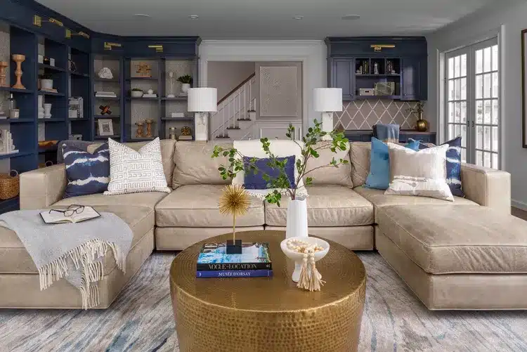
Living spaces often benefit from warm neutrals or balanced palettes that encourage comfort and conversation. Layering soft textures with subtle color accents adds depth without overwhelming the space.
Kitchen and Dining Areas

Credit: Carter Kay Interiors
In kitchens and dining areas, color plays a more expressive role. Warmer tones like terracotta, muted reds, and soft yellows naturally energize the space, making it feel welcoming and social. When paired with natural materials and balanced neutrals, these hues create an atmosphere that encourages gathering while still feeling cohesive and intentional.
Bedrooms

Credit: Sharps
Cooler hues such as soft blues, greens, or muted lavenders promote relaxation and rest, while warm neutrals like beige, soft browns, and natural wood tones create a grounding and comforting atmosphere.
Home Offices

Credit: Tamsin Johnson
Home offices benefit from balanced palettes that support focus while maintaining visual interest. Soft, muted colors, such as gentle greens, blues, or warm neutrals, help create a calm and productive environment. When thoughtfully combined with natural materials and subtle contrast, these tones enhance concentration without feeling sterile or overly stimulating.
How Designers Test Paint Colors Before Committing
Lighting dramatically affects how paint colors appear. A shade that looks perfect on a small sample card can appear very different once applied to a wall.
Professional designers rarely select colors remotely. Instead they test large paint samples directly in the space.
Testing should consider several factors:
Natural Light throughout the day
Morning and evening light can shift undertones dramatically.
Artificial Lighting
Warm lighting can make colors appear warmer, while cooler lighting can emphasize blue undertones.
Surface Finish
Matte, satin, and gloss finishes reflect light differently, which can subtly alter color perception.
Texture also plays a role. Rough or matte surfaces often appear slightly darker than glossy surfaces. For this reason, paint samples should ideally match the final material and finish.
The Designer Rules Worth Remembering
- Interior designers follow a few guiding principles when working with color.
- Do not choose paint colors remotely. Always observe them within the room.
- Consider light first, color second.
- Use bold colors intentionally rather than timidly. Half-measures often feel less cohesive than a confident palette.
- Reserve trends for accessories and accents while keeping foundational colors timeless.
See More Posts
When Vision Meets Legacy: Fabiola Avelino x Gaggenau
A Kitchen That Tells a Story Design is more than an arrangement of furniture…

What we saw at Coverings and how tile is shaping the next direction of Interior Design
Inside Coverings 2026Tile Trends 2026 Interior Design: Why Tile Is No Longer…

They Were Designed To Be Just Stairs, Until They Steal the Show
In luxury interiors, designers often overlook stairs, treating them as mere…